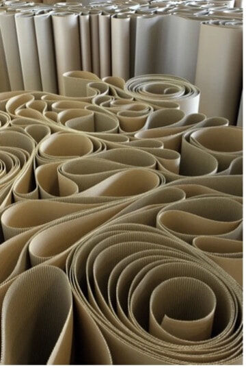
The concept for my vitrine derived originally from the word 'play'. Inspired by Italian designers, who first applied the theme "Abandoned Playfulness" to their designs at the 1954 Triennial event. Italian Design is now described as ‘artistic and useful'. Hence, the body shell aesthetic for most Italian design is an attempt to turn mass-produced forms into sculptural, playful art forms. The word play or playful recollects lost and past joyful life scenarios such as one's infancy, and how play can slowly transform or even disappear as we convert to adults. The part of my life where I contact play is through the process of making art. I was particularly influenced by Italian artist Michelangelo Pistoletto and his site-specific installation titled The Mirror of Judgement, 1965. An interactive piece, resembling a labyrinth or maze, he applies rolls of corrugated cardboard that loosely unfurl and retain a coiled appearance formed by undulating waves, through which the spectator navigates to the centre of the piece and finally arrives at a mirror. Interestingly, the artwork is organised and not made, it has no joins, no supports, and no other materials. As simple as it may appear, it is complex and layered and the material has been carefully designed and arranged.
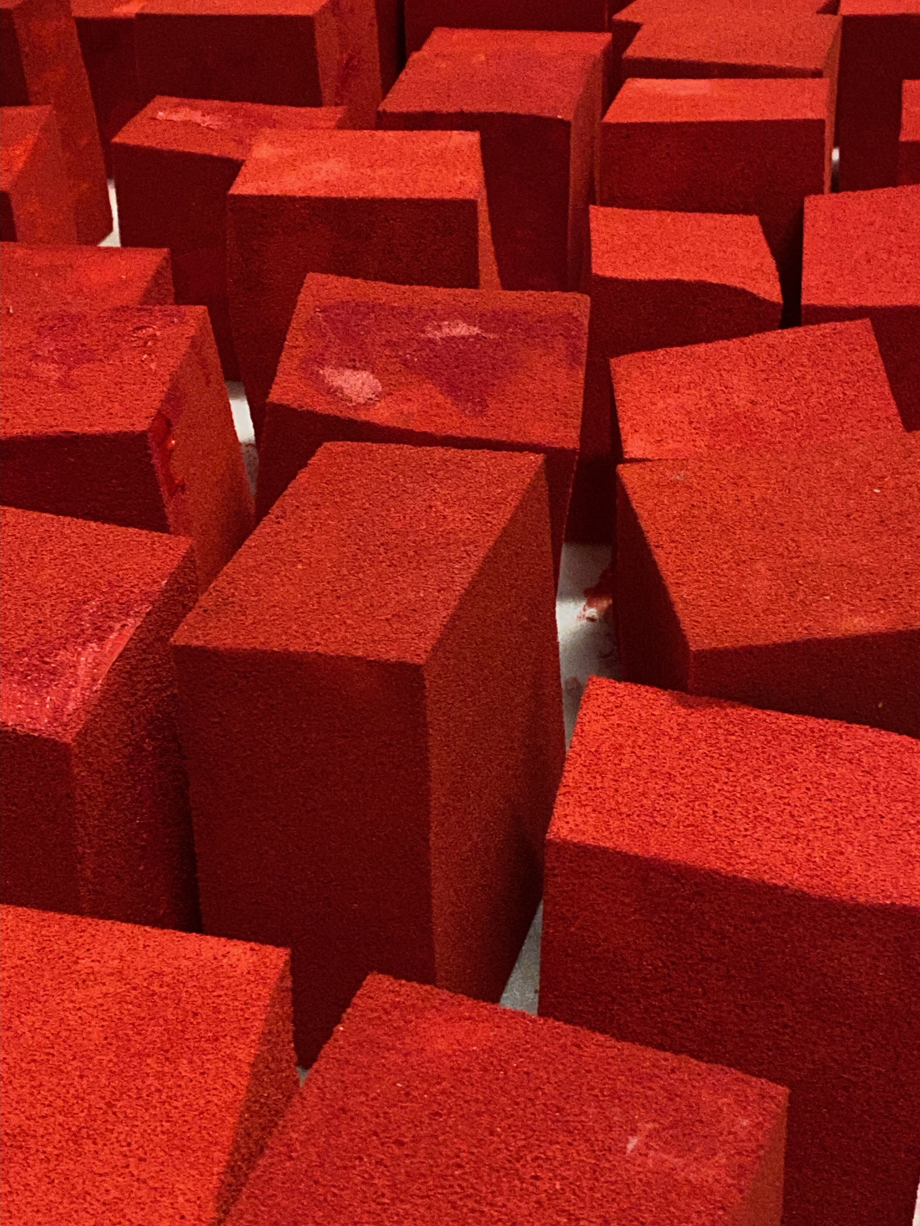
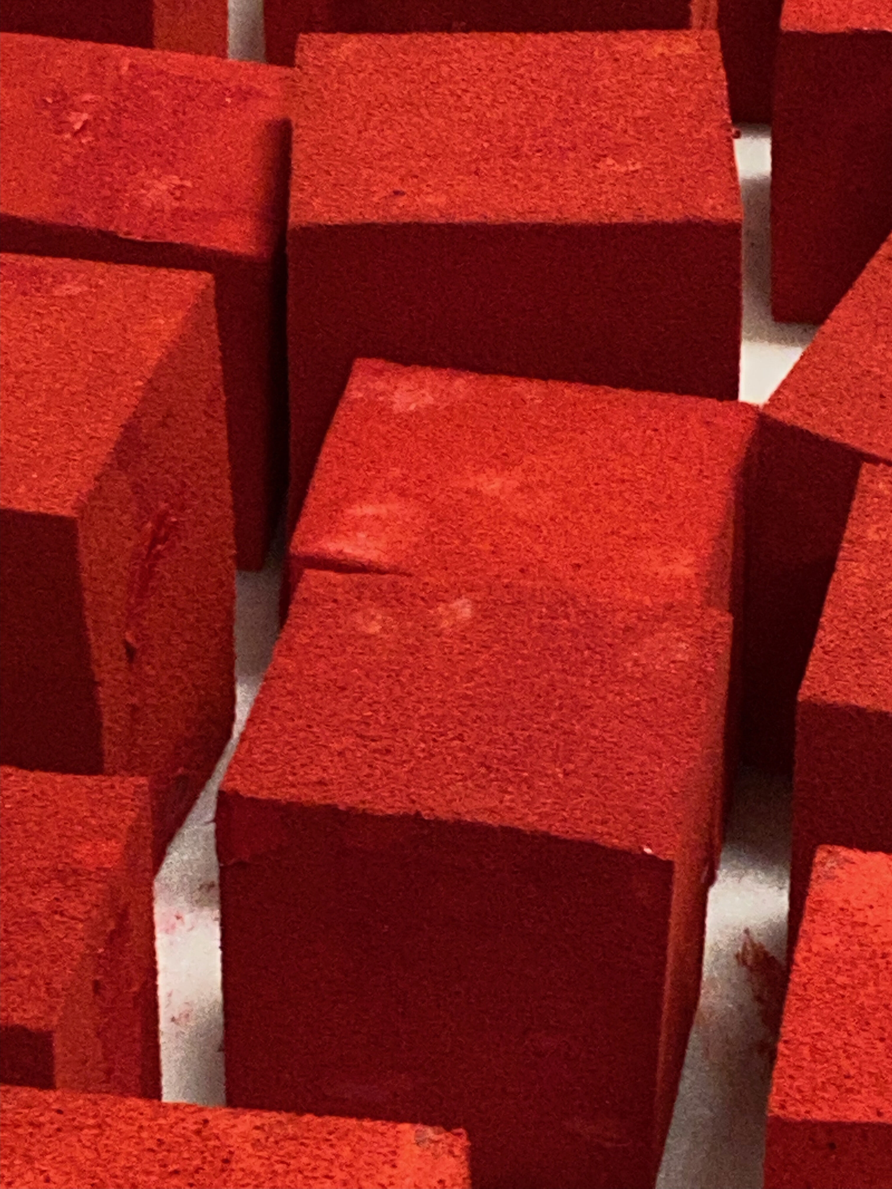
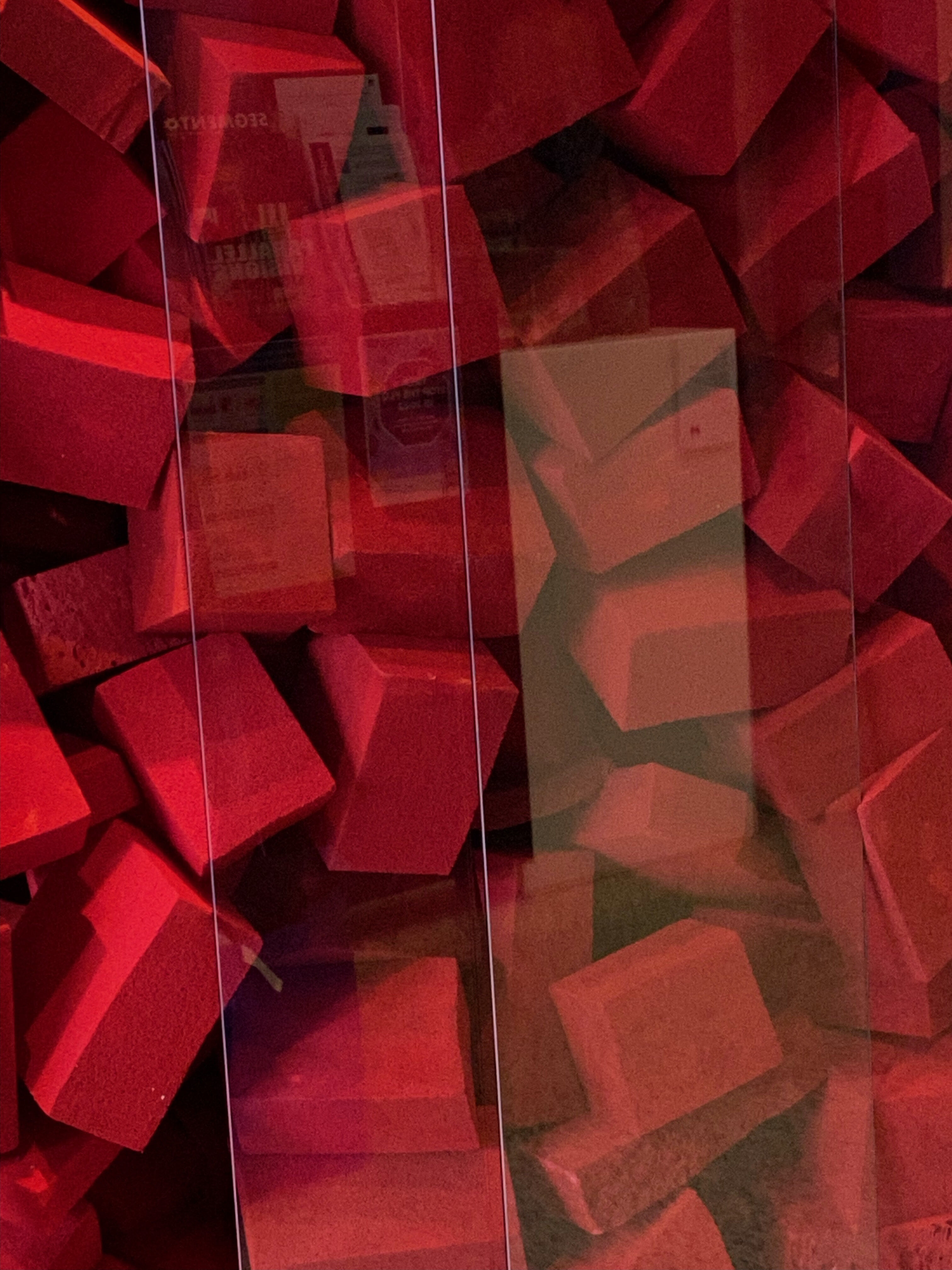
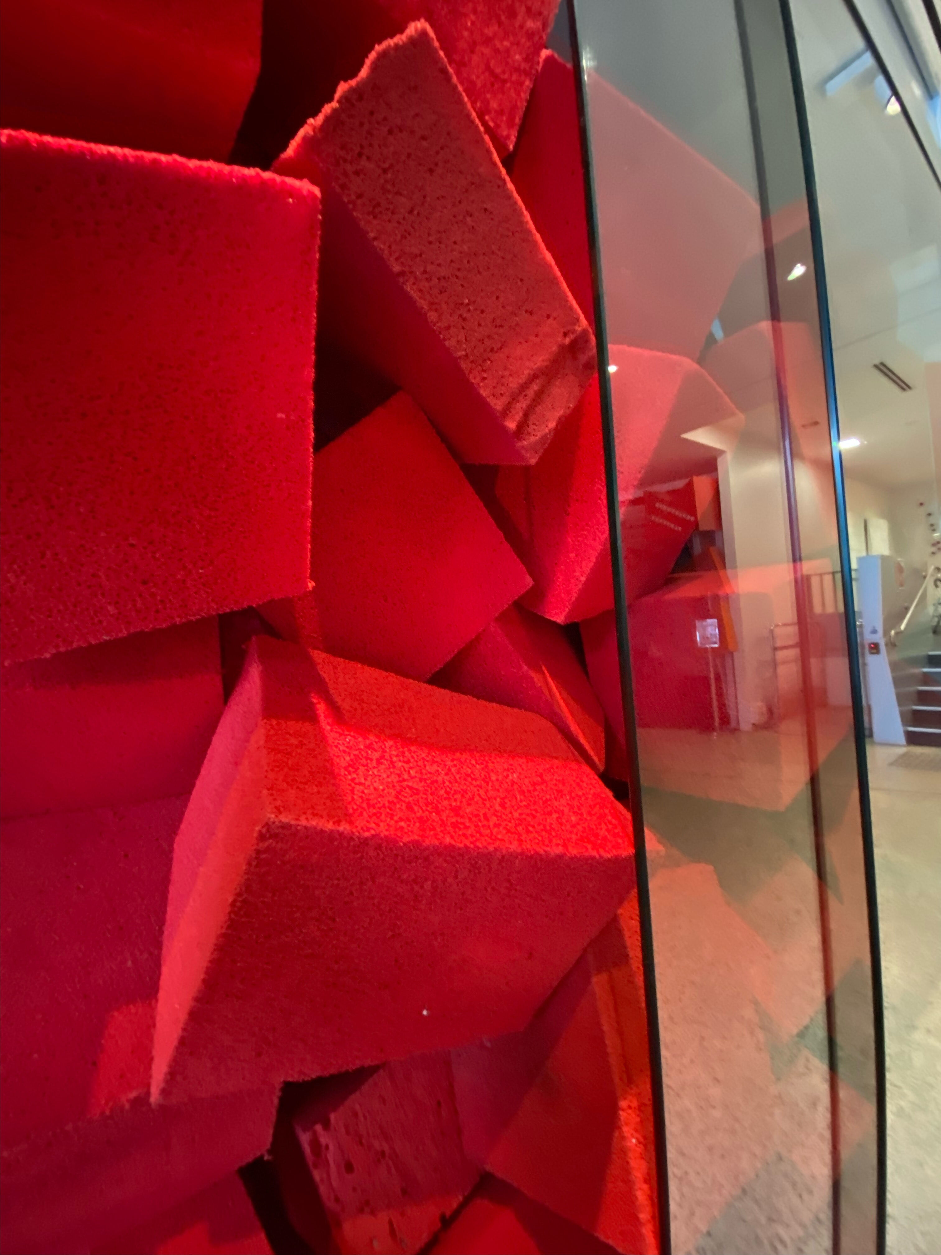
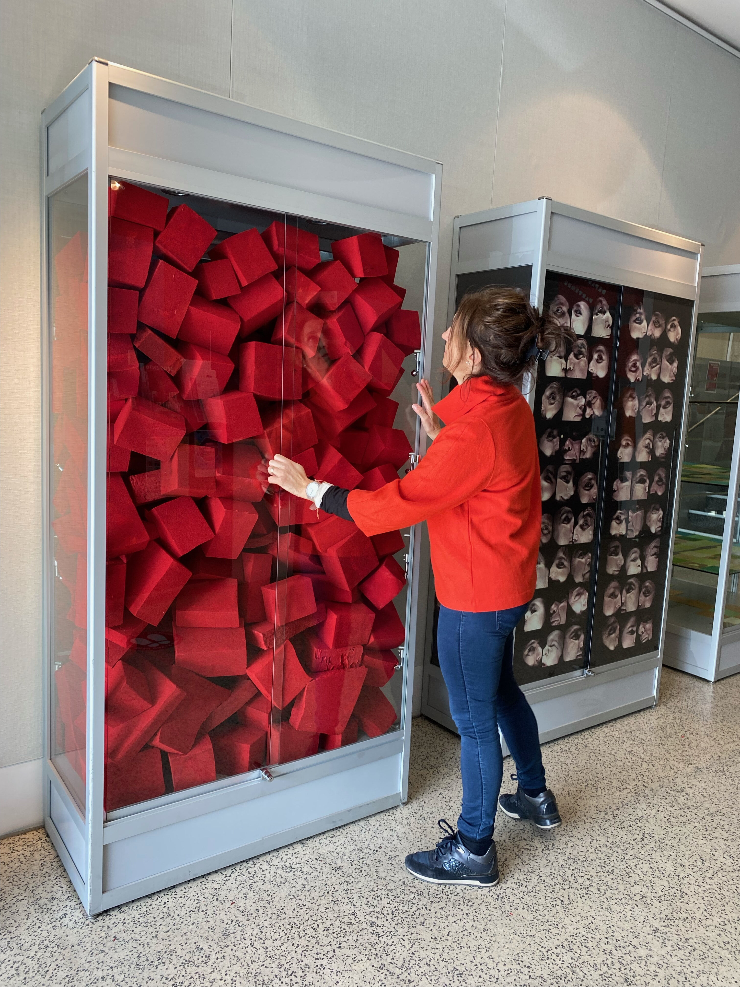
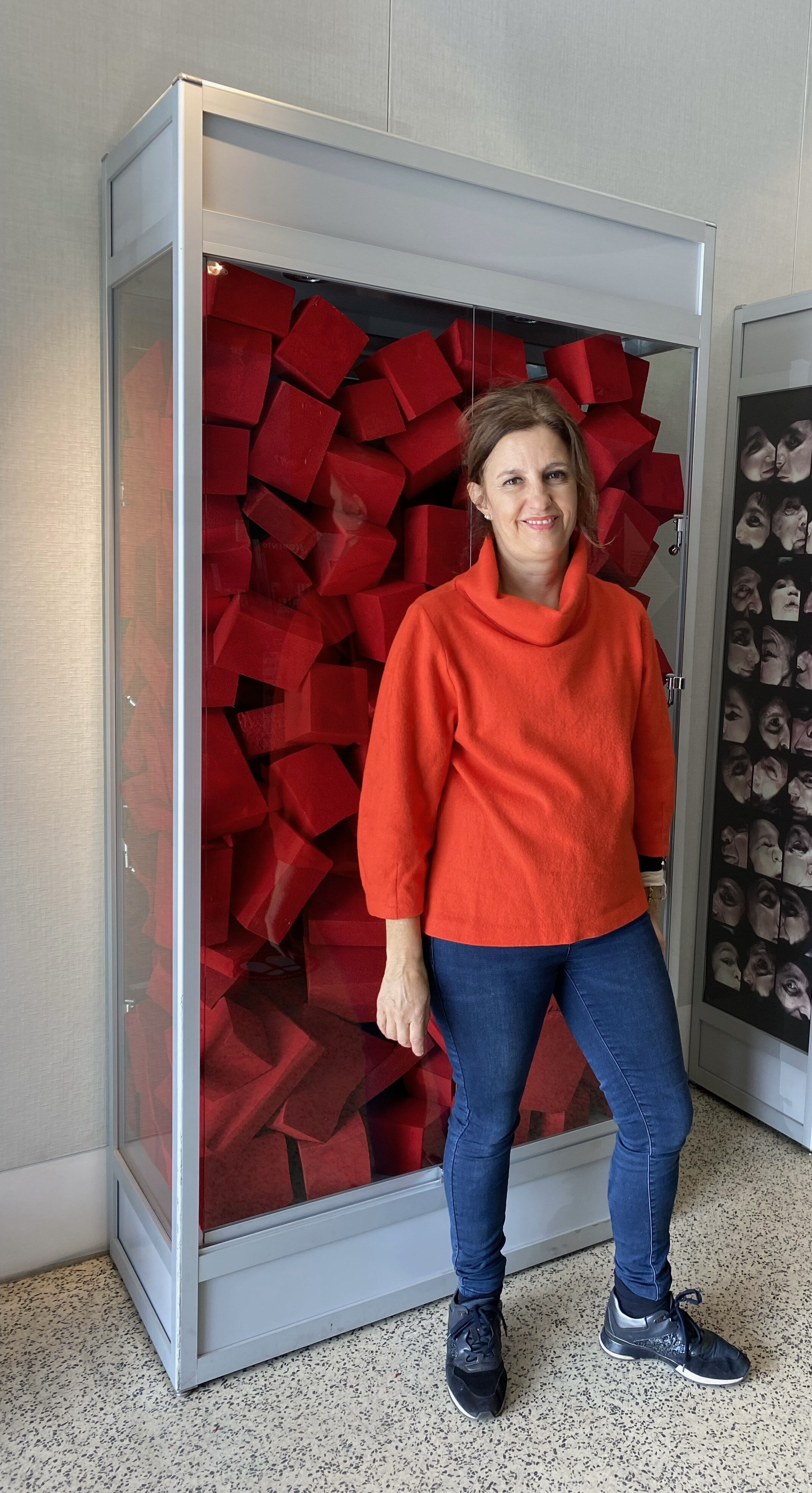
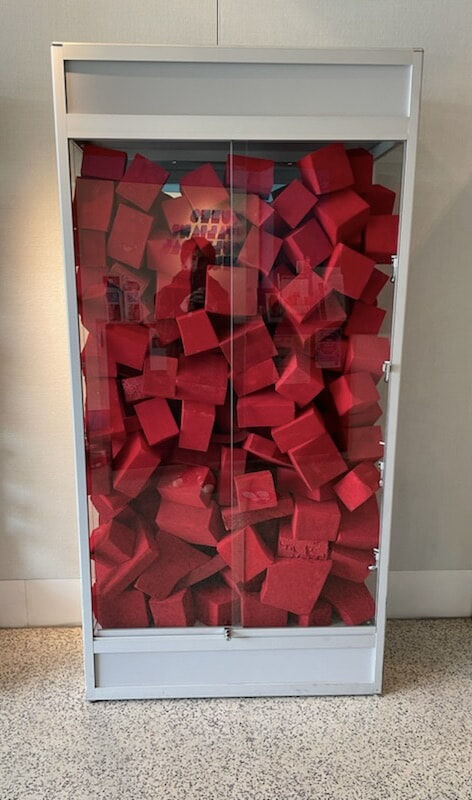
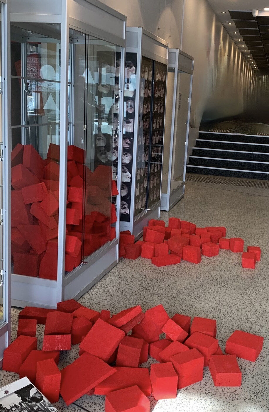
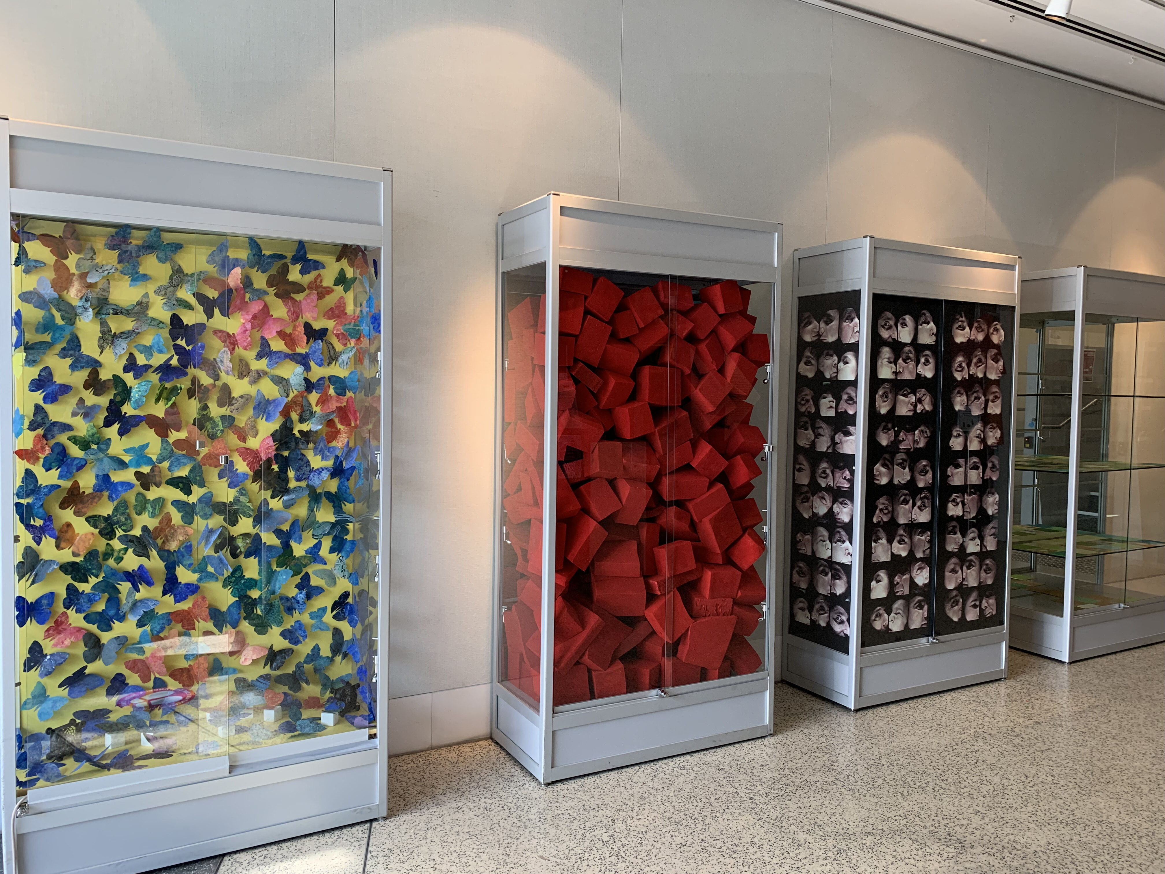
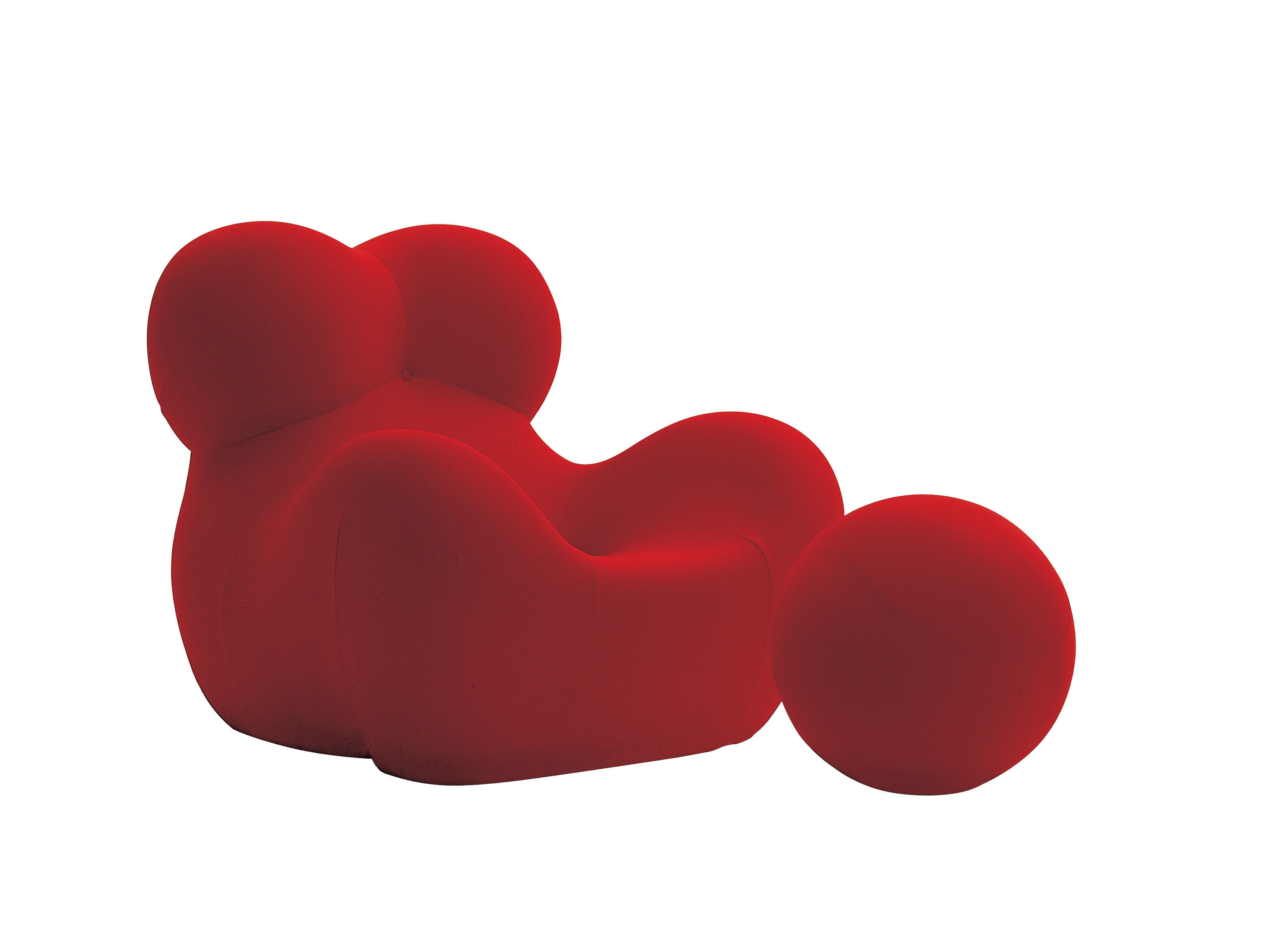
The notion of space has always captivated me. This new work titled Placement Displacement - ‘Per Giocare’-(To Play) is made up of irregular foam pieces that have been carefully and intentionally inserted and placed delicately into the vitrine’s interior space, and the foam pieces appear to have been ‘stuffed’ quickly and without thought. Installation art is often seen in architectural spaces, like that of Pistolletto’s. My art piece is an attempt to convert the vitrine into a miniature interior space- a minute gallery, also including a mirror, but obscured by pieces of red foam that have been individually hand painted. The vitrine could be a moment of reflection or reflection- a thought/contemplation- a study. The use of foam connects with my previous artwork ‘La Mamma Dispersa 2020, inspired by Italian designer Gaetano Pesce 1939- and his UP Series c1968 of furniture chair designs, made from polyurethane foam. Like Pistoletto’s piece, Pesce’s design for the La Mamma Chair also has no structure, no supports, and no joins. The chair compresses down into a vacuum-packed envelope and expands back into its form once the pack is opened. The notion of an object being compressed into a tight space and then transforming into a three-dimensional form resonates with my attempt to understand the potential of space. In this instance, I aim to compress and place as many pieces of foam as possible into a glass box. I often ponder about form and its placement within space and the meaning of atmosphere and how it may connect with the human dimension. The colour red is intended to link with the red colour of Pesce’s Chair 'LaMamma". I frequently use red in my work and often wonder why. We all have an intimate colour palette and I often engage with the obviousness and complexities of red. When this hue is applied to my work, it conjures a form of silence or deep pause, like the colour white, which I frequently use in my canvas work. I question how art can be a medium for obscured messages that expose subtle layers of social and human understanding, to the point where one may reflect on their own personal existence.
Michelangelo Pistoletto – The Mirror of Judgement, 1965